This post is an advanced guide on customizing the Astro AntfuStyle Theme. If you have not yet configured the src/config.ts file, it is recommended to first review Basic Configuration.
Customizing Logo#
Designing Your Own Logo
Generate a text-based logo using Google Font to Svg Path or create one with AI tools. If proficient, you could use Adobe Illustrator for more professional designs.
Once your logo’s SVG file is ready, you’ll need to update the LogoButton component and the template for the autogenerated OG Images to include your new logo.
Modifying the LogoButton Component
Open src/components/widgets/LogoButton.astro. This file contains both an ICON SVG and a TEXT SVG, which are currently commented. You can uncomment and switch between them to see different effects.
Replace the existing SVG with your logo’s SVG in this component. Ensure to keep the aria-hidden="true" attribute within the <svg> tag for accessibility purposes.
If your logo includes black and white, you may need to adjust for theme changes between light and dark modes:
// Method 1: Specify colors for dark mode<path class="dark:fill-[#fff] dark:stroke-[#000]" fill="#fff" stroke="#000" ...></path>
// Method 2: Use color inversion for dark mode// (not suitable for non-black and white colors, check before applying!)<path class="dark:filter-invert-100" ...></path>
Further customize your logo using CSS in the <style> block or remove it and apply UnoCSS utilities directly—for opacity, scaling, or animations (see Animated SVG Logo).
Modifying the Autogenerated OG Images Template
Open the src/utils/og-image/template/markup.ts file and replace the SVG section entirely.
You may need to adjust the SVG element’s width, height, and viewBox attributes to fit properly. It’s recommended to paste the code below into the Satori: OG Image Playground under the Tailwind (experimental) tab for testing.
<div tw="flex items-center justify-start w-full px-18" style="gap: 20px"> <div tw="self-start flex justify-center items-center"> <!-- Replace Your SVG Logo Here --> </div> <div tw="flex flex-col" style="gap: 10px"> <div tw="text-[#858585] text-2.1rem">${authorOrBrand}</div> <div tw="text-white text-3.1rem leading-relaxed mr-18">${title}</div> </div></div>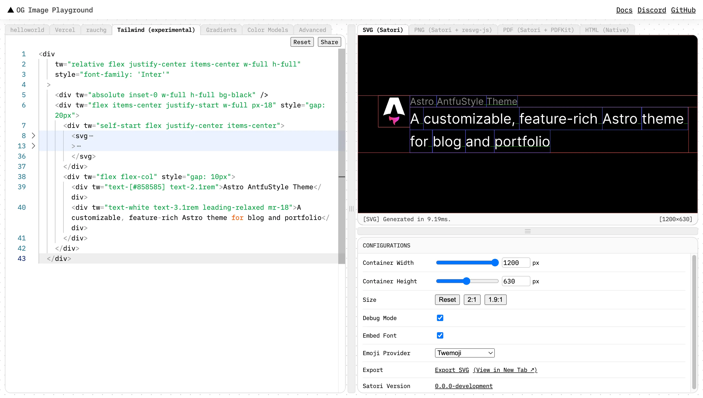
Adjust black elements in your logo
Since the theme’s OG Images use dark backgrounds, modify any pure black elements in your logo to white for better visibility.
Replacing the Website Icon#
Once you’ve customized the logo and have the SVG file, it’s time to generate the necessary icons to replace the website’s favicon. You’ll need to generate the following Ultimate Favicon Setup:
favicon.ico: For legacy browsers.favicon.svg: A single SVG icon with light/dark modes for modern browsers.apple-touch-icon.png: A 180×180 PNG for Apple devices.icon-192.png,icon-512.png,icon-mask.png: Icons for the web app manifest, including a 192×192 icon for home screens, a 512×512 maskable icon for different Android launchers, and a 512×512 icon for splash screens when the PWA (Progressive Web App) is loading.
Web App Manifest
A web app manifest is a JSON file that helps a browser install your website as an app. It originated from Google’s PWA initiative.
First, open the favicon.svg file in a text editor. Add <style> to adjust the fill color based on the theme:
<svg xmlns="http://www.w3.org/2000/svg" viewBox="0 0 500 500"> <style> .path { fill: #17191e } @media (prefers-color-scheme: dark) { .path { fill: #f0f0f0 } } </style> <path d="…"></path></svg>Alternative way to make favicons respond to theme changes
In the implementation mentioned above, the browser always downloads the same file on initial load. When the user switches the system or browser theme, the browser doesn’t re-parse the SVG, so the favicon only updates after a page refresh or reopening the tab.
For real-time responsiveness, you can store separate files like favicon-light.svg and favicon-dark.svg, and update Head.astro as follows:
<!-- Icon --><link rel="icon" type="image/svg+xml" href={withBasePath('/favicon-light.svg')} media="(prefers-color-scheme: light)"><link rel="icon" type="image/svg+xml" href={withBasePath('/favicon-dark.svg')} media="(prefers-color-scheme: dark)"><link rel="icon" type="image/svg+xml" href={withBasePath('/favicon.svg')} /><link rel="icon" sizes="32x32" href={withBasePath('/favicon.ico')} /><link rel="apple-touch-icon" href={withBasePath('/apple-touch-icon.png')} />Note that Firefox has not yet implemented link level media query switching of favicon.
Next, use the steps in How to Favicon in 2024 or Real Favicon Generator to generate the icons. Rename the files as mentioned above and copy them to the public directory to replace the existing ones.
Lastly, update src/pages/app.webmanifest.js with the following:
import { withBasePath } from '~/utils/path'
export async function GET() {  // https://developer.mozilla.org/en-US/docs/Web/Progressive_web_apps/Manifest  const manifest = {    id: withBasePath('/'),    name: 'Astro AntfuStyle Theme',    short_name: 'AntfuStyle',    description:      'A customizable, feature-rich Astro theme for blog and portfolio',    icons: [      {        src: withBasePath('icon-192.png'),        type: 'image/png',        sizes: '192x192',      },      {        src: withBasePath('icon-512.png'),        type: 'image/png',        sizes: '512x512',      },      {        src: withBasePath('icon-mask.png'),        type: 'image/png',        sizes: '512x512',        purpose: 'maskable',      },    ],    scope: withBasePath('/'),    start_url: withBasePath('/'),    display: 'standalone',    theme_color: '#fff',    background_color: '#fff',  }
  return new Response(JSON.stringify(manifest), {    headers: {      'Content-Type': 'application/manifest+json; charset=utf-8',    },  })}
If you don’t need PWA support, you can delete app.webmanifest.js, icon-192.png, icon-512.png, and icon-mask.png.
Handling icons after using Real Favicon Generator
If you use Real Favicon Generator, rename android-chrome-192x192.png to icon-192.png and copy android-chrome-512x512.png twice, renaming one to icon-512.png and the other to icon-mask.png.
Check the icon-mask.png with maskable.app to ensure it meets the requirements for maskable icons. It should have bigger paddings around the icon so it can be cropped by the launcher to fit its design. The safe zone is a central circle of 409×409.
Customizing Website Styles#
While the theme offers some quick UI configuration options in the src/config.ts, these are limited. If you’re familiar with CSS, you can fully customize the website styles, but it’s recommended to follow the methods outlined below.
Styling approaches
- UnoCSS utility classes using the Wind3 preset (ua compact preset compatible with Tailwind CSS 3 and Windi CSS)
- Custom CSS utility classes (in
unocss.config.tsunderrulesandshortcuts) - Native CSS (in CSS files and component
<style>tags)
 UnoCSS
 Tailwind CSS 3
 Windi CSS
Where styles are defined
styles/main.css: Global styles.styles/prose.css: Prose-related styles.styles/markdown.css: Plugin- and integration-related styles.src/components/: Component-specific styles.
To modify CSS rulesets in the stylesheets
For example, adjusting the max-width of prose content:
// Original styles, do not modify directly!.prose { max-width: 65ch; font-size: 1rem; line-height: 1.75;}// Create a new `.css` file in the `src/styles` directory// Use the same selector with updated properties.prose { max-width: 70ch;}import '~/styles/main.css'import '~/styles/prose.css'import '~/styles/markdown.css'
// Import your custom file after the othersimport '~/styles/your.css'To modify specific component styles
For example, changing the font of group titles on the /projects page:
...
<div ...> { !wide ? ( ... ) : ( <span // Add a custom class class={`custom-class absolute top-0 op-35 dark:op-20 ...`} > {text} </span> ) }</div>// Create a new `.css` file in the `src/styles` directory// Write styles using the class selector.custom-class { font-family: 'Gill Sans', 'Gill Sans MT', Calibri, 'Trebuchet MS', sans-serif;}Additional style modification tips
- Avoid modifying the core stylesheets or component
<style>sections directly for easier updates, as future theme versions may bring changes. - Create a new
src/styles/your.cssfile and override styles using class selectors. - For details on style application precedence in Astro, refer to Astro - CSS & Styling - Cascading Order. If your styles don’t apply, check for CSS specificity and try using
!importantas needed.
Customizing Fonts#
Before changing font settings, read Font Setup & Usage for the current font families, where they are used, and how they are loaded.
The theme uses Astro Fonts as the source of truth. A complete font configuration has three parts:
- Register the font in
astro.config.tswithname,cssVariable, provider options, and fallbacks. - Render that CSS variable with
<Font />insrc/components/base/Head.astro. - Use the variable directly in CSS, or map it to a UnoCSS utility in
unocss.config.ts.
In the examples below, replace customFontName with the real font family name supported by the provider you choose.
To change the font behind an existing variable, keep cssVariable unchanged and update that entry in astro.config.ts. For example, this replaces the font used by --font-sans, so existing font-sans utilities and var(--font-sans) styles keep working:
import { defineConfig, fontProviders } from 'astro/config'
const sansFallbacks = [  'ui-sans-serif',  ...]
export default defineConfig({  ...  fonts: [    {      provider: fontProviders.fontsource(),      name: 'Inter',      name: 'customFontName',      cssVariable: '--font-sans',      weights: ['100 900'],      styles: ['normal'],      subsets: ['latin'],      formats: ['woff2'],      fallbacks: sansFallbacks,    },  ],  ...})
To add a new CSS font variable, add another entry instead:
export default defineConfig({ ... fonts: [ ... { provider: fontProviders.fontsource(), name: 'customFontName', cssVariable: '--font-custom', weights: [400], styles: ['normal'], subsets: ['latin'], formats: ['woff2'], fallbacks: customFallbacks, }, ],})Then render the new variable in the shared head component:
<Font cssVariable="--font-sans" preload /><Font cssVariable="--font-mono" /><Font cssVariable="--font-condensed" /><Font cssVariable="--font-custom" />Only add preload to fonts needed for the first visible content; unnecessary preloads can slow down other critical resources.
After that, use it directly in CSS:
.custom-heading { font-family: var(--font-custom);}Or map it to a UnoCSS utility:
export default defineConfig({ ... extendTheme: (theme) => { return { ...theme, fontFamily: { ...theme.fontFamily, sans: 'var(--font-sans)', mono: 'var(--font-mono)', condensed: 'var(--font-condensed)', custom: 'var(--font-custom)', }, } },})<h2 class="font-custom">Custom font heading</h2>Use matching font fallbacks
Set fallbacks to fonts from the same general family as the main font. Use sans fallbacks for sans-serif fonts, mono fallbacks for code fonts, and serif fallbacks for serif fonts. Quote font family names that contain spaces, and keep a generic family such as sans-serif, monospace, or serif at the end.
Update all references when renaming CSS variables
If you rename an existing CSS variable instead of keeping it, update every place that references it: src/components/base/Head.astro, unocss.config.ts and direct CSS such as src/styles/markdown.css.
Customizing Footer#
You can directly modify the src/components/base/Footer.astro file. For instance, if you want to apply the CC BY-NC-SA 4.0 license, you can update the code as follows:
8 collapsed lines
---import Link from '~/components/base/Link.astro'import { SITE } from '~/config'
const currentYear = new Date().getFullYear()const copyrightText = `© ${currentYear} ${SITE.author}`---
<footer class="slide-enter animate-delay-1600! px-7 mt-auto mb-8"> <div class="prose mx-auto op-50"> <div class="flex lt-sm:flex-col items-center text-sm whitespace-nowrap"> <span> <Link class="op-100! color-[--fg]!" href="https://creativecommons.org/licenses/by-nc-sa/4.0/" title="CC BY-NC-SA 4.0" external={true} > CC BY-NC-SA 4.0 </Link> {' '} {copyrightText}12 collapsed lines
</span> <span class="lt-sm:hidden"> | </span> <span> Powered by {' '} <Link class="op-100! color-[--fg]!" href="https://github.com/lin-stephanie/astro-antfustyle-theme" external={true} > Astro AntfuStyle Theme </Link> </span> </div> </div></footer>Of course, it would be greatly appreciated if you could also keep the Powered by Astro AntfuStyle Theme part to help more people discover it. 😊
Configure Giscus Comments#
This theme integrates the Giscus comments. By default, users can comment on posts under blog/ after logging in with GitHub.
 Giscus
Follow the setup guide to make your GitHub repo public, install the Giscus app, enable Discussions, and obtain the config needed for the FEATURES.giscus option in src/config.ts. This is used in Giscus.astro. You can also tweak it per the Giscus docs.
For styling, the theme serves custom CSS from /giscus/light.css and /giscus/dark.css, based on modified styles of the ‘noborder_light’ and ‘noborder_dark’ themes. These routes are generated by one dynamic Astro CSS endpoint (src/pages/giscus/[theme].css.ts) that injects the self-hosted normal Inter @font-face rule generated by Astro Fonts.
Because Giscus runs inside an iframe, it cannot inherit the parent page’s CSS variables or @font-face rules. To allow https://giscus.app to load the theme CSS and font files, the local dev server and the production host both need to allow that cross-origin request:
- Development: The theme already configures two settings in
astro.config.ts:security.allowedDomainslets Astro’s dev request filter accepthttps://giscus.app, andvite.server.headersadds the CORS response header that lets the Giscus iframe load/giscus/*.cssand/_astro/fonts/*locally:
export default defineConfig({ ... security: { allowedDomains: [ { hostname: 'giscus.app', protocol: 'https', }, ], }, vite: { server: { headers: { 'Access-Control-Allow-Origin': 'https://giscus.app', }, }, },})- Production: Ensure your host serves both the custom CSS and Astro font files with proper CORS headers. If you’re on Vercel, the theme’s
vercel.jsonalready includes this setup. But if you use another platform, you’ll need to manually configure it. For example, on Netlify, create a_headersfile:
/giscus/* Access-Control-Allow-Origin: https://giscus.app/_astro/fonts/* Access-Control-Allow-Origin: https://giscus.appIf you prefer to use Giscus’s built-in themes directly, update Giscus.astro, ThemeSwitch.astro, and astro.config.ts as shown below, and remove the unused [theme].css.ts endpoints, src/styles/giscus/, and related CORS config.
<script>  import { FEATURES } from '~/config'
const giscusThemeLight = withClientBasePath('giscus/light.css') const giscusThemeDark = withClientBasePath('giscus/dark.css') const giscusThemeLight = 'noborder_light' const giscusThemeDark = 'noborder_dark' ...</script><script> const changeGiscusTheme = (isDark: boolean) => { const newTheme = isDark ? withClientBasePath('giscus/dark.css') : withClientBasePath('giscus/light.css') ? 'noborder_dark' : 'noborder_light' ... }</script>How to enable or disable Giscus
To disable Giscus globally, set FEATURES.giscus to false in src/config.ts.
To disable it for a specific post, set giscus: false in the post’s frontmatter.
You can also control it via the isCommentable prop (default false) when using RenderPost.astro.
Restricting allowed domains for Giscus
To limit which domains can load Giscus with your repo’s discussions, create a giscus.json file in the project root and configure it as shown here.
Final Cleanup#
Finally, you may want to:
- Remove the
.githubdirectory (mainly for workflows and templates, but thescheduled-vercel-deploy.ymlfile may be useful for Customizing GitHub Activity Pages). - Clean up the
src/content/,src/assets/, and other directories. - Review
.vscode/settings.jsonfor adjustments. - Rewrite
README.md. - Delete anything you don’t need and know is safe.
Wrapping Up#
This is a general overview of what you can customize in the project. If you’re proficient with code, there’s even more you can personalize!
Next, check out Authoring Content to learn how to tailor each page to your liking.
If you encounter any issues, find errors, or see opportunities for improvement, feel free to join the discussion or submit an issue or pull request. Your feedback is highly appreciated! ❤️
Changelog
2025-05-20
2025-07-16
- Add an alternative way to make favicons respond to theme changes
2026-07-07
- Update Customizing Fonts, Customizing Footer, and Configure Giscus Comments